CardUpdated
Flexible container component for grouping related content and actions
Import
import { Card } from "@heroui/react";Usage
PAYMENT
You can now withdraw on crypto.
Add your wallet in settings to withdraw
"use client";

import {Card, Link} from "@heroui/react";
import {Icon} from "@iconify/react";

export function Default() {
  return (
    <Card.Root className="w-[400px]">
      <Icon
        aria-label="Dollar sign icon"
        className="text-primary size-6"
        icon="gravity-ui:circle-dollar"
        role="img"
      />
      <Card.Header>
        <Card.Title>PAYMENT</Card.Title>
        <Card.Description>You can now withdraw on crypto.</Card.Description>
      </Card.Header>
      <Card.Content id="payment-content">
        <p>Add your wallet in settings to withdraw</p>
      </Card.Content>
      <Card.Footer>
        <Link.Root
          aria-label="Go to settings (opens in new tab)"
          href="https://heroui.com"
          rel="noopener noreferrer"
          target="_blank"
        >
          Go to settings
          <Link.Icon aria-hidden="true" />
        </Link.Root>
      </Card.Footer>
    </Card.Root>
  );
}
Anatomy
Import the Card component and access all parts using dot notation.
import { Card } from "@heroui/react";

export default () => (
  <Card.Root>
    <Card.Header>
      <Card.Title />
      <Card.Description />
    </Card.Header>
    <Card.Content />
    <Card.Footer />
  </Card.Root>
);
Variants
Cards come in semantic variants that describe their prominence level rather than specific visual styles. This allows themes to interpret them differently:
Transparent
Minimal prominence with transparent background
Use for less important content or nested cards
Default
Standard card appearance (surface-secondary)
The default card variant for most use cases
Secondary
Medium prominence (surface-tertiary)
Use to draw moderate attention
Tertiary
Higher prominence (surface-quaternary)
Use for important content
"use client";

import {Card} from "@heroui/react";

export function Variants() {
  return (
    <div className="flex flex-col gap-4">
      <Card.Root className="w-[320px]" variant="transparent">
        <Card.Header>
          <Card.Title>Transparent</Card.Title>
          <Card.Description>Minimal prominence with transparent background</Card.Description>
        </Card.Header>
        <Card.Content>
          <p>Use for less important content or nested cards</p>
        </Card.Content>
      </Card.Root>

      <Card.Root className="w-[320px]" variant="default">
        <Card.Header>
          <Card.Title>Default</Card.Title>
          <Card.Description>Standard card appearance (surface-secondary)</Card.Description>
        </Card.Header>
        <Card.Content>
          <p>The default card variant for most use cases</p>
        </Card.Content>
      </Card.Root>

      <Card.Root className="w-[320px]" variant="secondary">
        <Card.Header>
          <Card.Title>Secondary</Card.Title>
          <Card.Description>Medium prominence (surface-tertiary)</Card.Description>
        </Card.Header>
        <Card.Content>
          <p>Use to draw moderate attention</p>
        </Card.Content>
      </Card.Root>

      <Card.Root className="w-[320px]" variant="tertiary">
        <Card.Header>
          <Card.Title>Tertiary</Card.Title>
          <Card.Description>Higher prominence (surface-quaternary)</Card.Description>
        </Card.Header>
        <Card.Content>
          <p>Use for important content</p>
        </Card.Content>
      </Card.Root>
    </div>
  );
}transparent- Minimal prominence, transparent background (great for nested cards)default- Standard card for most use cases (surface-secondary)secondary- Medium prominence to draw moderate attention (surface-tertiary)tertiary- Higher prominence for important content (surface-quaternary)quaternary- Highest prominence for critical content
Horizontal Layout
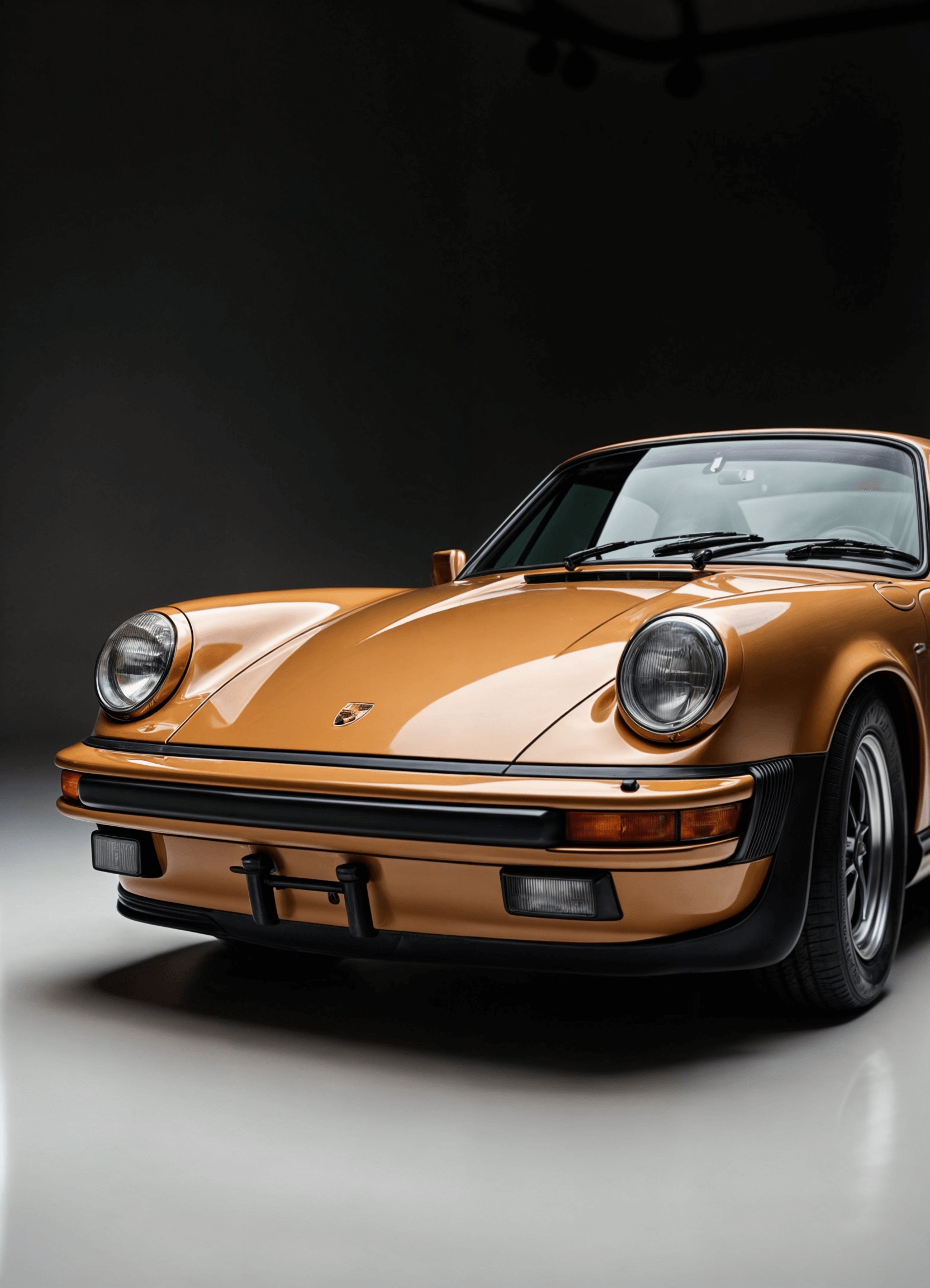
Get the new Porsche 911 golden edition
Experience unmatched luxury and performance with the Porsche 911 Golden Edition—where sleek design meets cutting-edge tech and pure driving thrill.
"use client";

import {Button, Card} from "@heroui/react";

export function Horizontal() {
  return (
    <Card.Root className="w-full items-stretch md:flex-row">
      <img
        alt="Porsche 911 Golden Edition"
        className="pointer-events-none aspect-square w-full select-none rounded-3xl object-cover md:max-w-[136px]"
        loading="lazy"
        src="https://heroui-assets.nyc3.cdn.digitaloceanspaces.com/components/card/porsche-911.png"
      />
      <div className="flex flex-1 flex-col gap-3">
        <Card.Header className="gap-1">
          <Card.Title>Get the new Porsche 911 golden edition</Card.Title>
          <Card.Description>
            Experience unmatched luxury and performance with the Porsche 911 Golden Edition—where
            sleek design meets cutting-edge tech and pure driving thrill.
          </Card.Description>
        </Card.Header>
        <Card.Footer className="mt-auto flex w-full flex-row items-center justify-between">
          <div className="flex flex-col">
            <span
              aria-label="Price: 36,799 US dollars"
              className="text-foreground text-sm font-medium"
            >
              $36,799
            </span>
            <span aria-label="Available stock: 11 units" className="text-muted text-xs">
              11 available
            </span>
          </div>
          <Button>Buy Now</Button>
        </Card.Footer>
      </div>
    </Card.Root>
  );
}
With Avatar
Indie Hackers
148 members
AI Builders
362 members
"use client";
import {Avatar, Card} from "@heroui/react";
export function WithAvatar() {
return (
<div className="flex flex-col gap-4 md:flex-row">
<Card.Root className="w-[200px] gap-2">
<img
alt="Indie Hackers community"
className="pointer-events-none aspect-square w-14 select-none rounded-3xl object-cover"
loading="lazy"
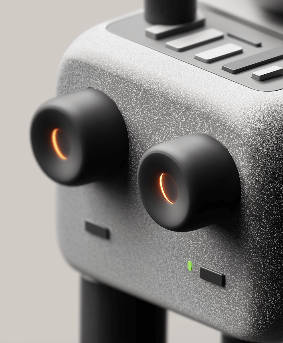
src="https://heroui-assets.nyc3.cdn.digitaloceanspaces.com/components/card/device.png"
/>
<Card.Header>
<Card.Title>Indie Hackers</Card.Title>
<Card.Description>148 members</Card.Description>
</Card.Header>
<Card.Footer className="flex gap-2">
<Avatar.Root aria-label="Martha's profile picture" className="size-5" role="img">
<Avatar.Image
alt="Martha's avatar"
src="https://img.heroui.chat/image/avatar?w=160&h=160"
/>
<Avatar.Fallback className="text-xs">IH</Avatar.Fallback>
</Avatar.Root>
<span className="text-xs">By Martha</span>
</Card.Footer>
</Card.Root>
<Card.Root className="w-[200px] gap-2">
<img
alt="AI Builders community"
className="pointer-events-none aspect-square w-14 select-none rounded-3xl object-cover"
loading="lazy"
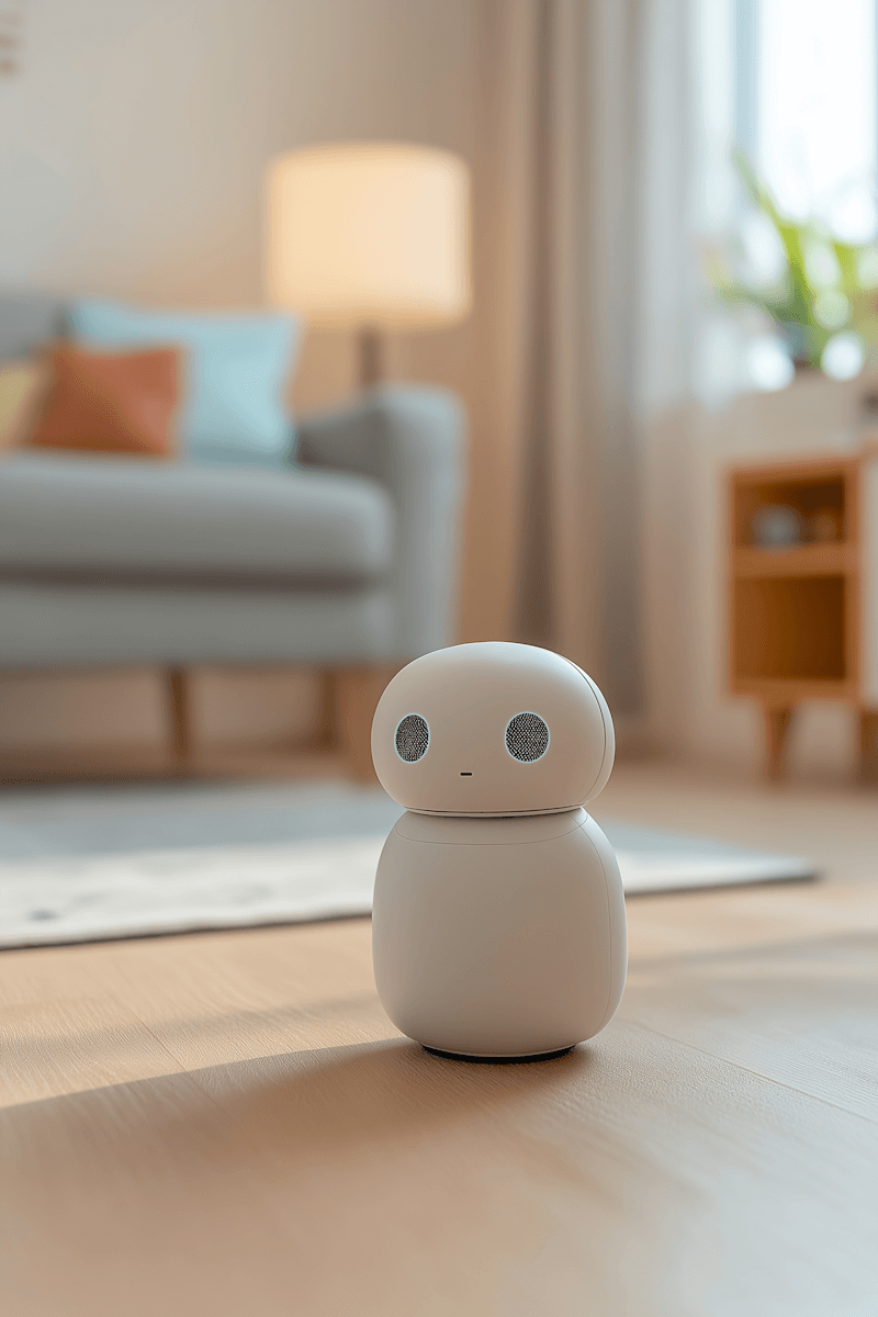
src="https://heroui-assets.nyc3.cdn.digitaloceanspaces.com/components/card/ai-bot.png"
/>
<Card.Header>
<Card.Title>AI Builders</Card.Title>
<Card.Description>362 members</Card.Description>
</Card.Header>
<Card.Footer className="flex gap-2">
<Avatar.Root aria-label="John's profile picture" className="size-5" role="img">
<Avatar.Image
alt="John's avatar - blue themed"
src="https://heroui-assets.nyc3.cdn.digitaloceanspaces.com/avatars/blue.jpg"
/>
<Avatar.Fallback className="text-xs">B</Avatar.Fallback>
</Avatar.Root>
<span className="text-xs">By John</span>
</Card.Footer>
</Card.Root>
</div>
);
}With Image

"use client";

import {Card} from "@heroui/react";

export function WithImage() {
  return (
    <div className="flex flex-col gap-4 md:flex-row">
      <Card.Root className="w-[220px] gap-2 p-1">
        <img
          alt="Luxury cars collection"
          className="block aspect-square w-full shrink-0 select-none rounded-[calc(theme(--radius-panel)-theme(spacing.1))] object-cover align-middle"
          loading="lazy"
          src="https://heroui-assets.nyc3.cdn.digitaloceanspaces.com/components/card/porsche-911.png"
        />
        <Card.Footer className="flex items-center justify-between px-2 text-sm">
          <span>Cars</span>
          <span aria-label="18 pictures in collection" className="text-muted">
            18 pictures
          </span>
        </Card.Footer>
      </Card.Root>

      <Card.Root className="w-[220px] gap-2 p-1">
        <img
          alt="Modern office workspace"
          className="block aspect-square w-full shrink-0 select-none rounded-[calc(theme(--radius-panel)-theme(spacing.1))] object-cover align-middle"
          loading="lazy"
          src="https://heroui-assets.nyc3.cdn.digitaloceanspaces.com/components/card/workspace.jpeg"
        />
        <Card.Footer className="flex items-center justify-between px-2 text-sm">
          <span>Workspaces</span>
          <span aria-label="56 pictures in collection" className="text-muted">
            56 pictures
          </span>
        </Card.Footer>
      </Card.Root>
    </div>
  );
}
With Background Image

PET HEALTH
Your pet deserve the best

"use client";

import {Button, Card} from "@heroui/react";
import {Icon} from "@iconify/react";

export function WithBackgroundImage() {
  return (
    <div className="flex flex-col items-center justify-center gap-6 md:flex-row">
      <Card.Root className="aspect-[280/337] w-full max-w-[280px]">
        {/* Background image */}
        <img
          alt="Happy pet"
          aria-hidden="true"
          className="pointer-events-none absolute inset-0 h-full w-full select-none object-cover"
          src="https://heroui-assets.nyc3.cdn.digitaloceanspaces.com/components/card/dog.png"
        />

        {/* Top gradient blur overlay */}
        <div
          aria-hidden="true"
          className="pointer-events-none absolute left-0 right-0 top-0 h-[76px]"
        >
          <div
            className="absolute inset-0 h-[-200%] backdrop-blur-sm"
            style={{
              WebkitMaskImage: "linear-gradient(to bottom, black 80%, transparent)",
              maskImage: "linear-gradient(to bottom, black 80%, transparent)",
              maskRepeat: "no-repeat",
              maskSize: "100% 100%",
            }}
          />
        </div>

        {/* Header */}
        <Card.Header className="z-10 text-white">
          <Card.Title className="text-xs font-medium tracking-wide text-white/80">
            PET HEALTH
          </Card.Title>
          <Card.Description className="text-lg font-medium leading-6 text-white">
            Your pet deserve the best
          </Card.Description>
        </Card.Header>

        {/* Bottom gradient blur overlay */}
        <div
          aria-hidden="true"
          className="pointer-events-none absolute bottom-0 left-0 right-0 h-[64px]"
        >
          <div
            className="absolute inset-0 h-[200%] backdrop-blur-sm"
            style={{
              WebkitMaskImage: "linear-gradient(to top, black 80%, transparent)",
              maskImage: "linear-gradient(to top, black 80%, transparent)",
              maskRepeat: "no-repeat",
              maskSize: "100% 100%",
            }}
          />
        </div>

        {/* Footer */}
        <Card.Footer className="z-10 mt-auto flex items-center justify-between">
          <div>
            <div className="text-sm font-medium text-white">Available soon</div>
            <div className="text-xs text-white/60">Get notified</div>
          </div>
          <Button size="sm" variant="tertiary">
            Notify me
          </Button>
        </Card.Footer>
      </Card.Root>

      <Card.Root className="aspect-[65/56] w-full md:w-[390px]">
        {/* Background image */}
        <img
          alt="Beautiful aerial view of Buenos Aires cityscape"
          aria-hidden="true"
          className="pointer-events-none absolute inset-0 h-full w-full select-none object-cover"
          src="https://heroui-assets.nyc3.cdn.digitaloceanspaces.com/components/card/mountain.png"
        />

        {/* Bottom gradient blur overlay */}
        <div
          aria-hidden="true"
          className="pointer-events-none absolute bottom-0 left-0 right-0 h-[64px]"
        >
          <div
            className="absolute inset-0 h-[200%] backdrop-blur-sm"
            style={{
              WebkitMaskImage: "linear-gradient(to top, black 80%, transparent)",
              maskImage: "linear-gradient(to top, black 80%, transparent)",
              maskRepeat: "no-repeat",
              maskSize: "100% 100%",
            }}
          />
        </div>

        {/* Footer */}
        <Card.Footer className="z-10 mt-auto flex items-center justify-between">
          <div>
            <div className="text-sm font-medium text-white">Buenos Aires</div>
            <div className="text-xs text-white/60">Argentina</div>
          </div>
          <Button aria-label="View Buenos Aires on map" size="sm" variant="tertiary">
            <Icon aria-hidden="true" icon="gravity-ui:map-pin" />
            Map
          </Button>
        </Card.Footer>
      </Card.Root>
    </div>
  );
}
With Form
Login
Enter your credentials to access your account
"use client";

import {Button, Card, Input, Label, Link, TextField} from "@heroui/react";

export function WithForm() {
  return (
    <Card.Root className="w-full max-w-md">
      <Card.Header>
        <Card.Title>Login</Card.Title>
        <Card.Description>Enter your credentials to access your account</Card.Description>
      </Card.Header>
      <Card.Content>
        <form className="flex flex-col gap-4">
          <TextField name="email" type="email">
            <Label>Email</Label>
            <Input placeholder="email@example.com" />
          </TextField>
          <TextField name="password" type="password">
            <Label>Password</Label>
            <Input placeholder="••••••••" />
          </TextField>
        </form>
      </Card.Content>
      <Card.Footer className="flex flex-col gap-2">
        <Button className="w-full">Sign In</Button>
        <Link.Root className="text-center text-sm" href="#">
          Forgot password?
        </Link.Root>
      </Card.Footer>
    </Card.Root>
  );
}
Accessibility
// Semantic markup
<Card.Root role="article" aria-labelledby="card-title">
  <Card.Header>
    <Card.Title id="card-title">Article Title</Card.Title>
  </Card.Header>
</Card.Root>

// Interactive cards
<Card.Root asChild>
  <a href="/details" aria-label="View product details">
    <Card.Title>Product Name</Card.Title>
  </a>
</Card.Root>
Styling
Component Customization
<Card.Root className="border-2 border-blue-500 bg-gradient-to-r from-blue-50 to-purple-50">
  <Card.Header>
    <Card.Title className="text-blue-900">Custom Styled Card</Card.Title>
    <Card.Description className="text-blue-700">Custom colors applied</Card.Description>
  </Card.Header>
  <Card.Content>
    <p className="text-blue-800">Content with custom styling</p>
  </Card.Content>
</Card.Root>
CSS Variable Overrides
/* Override specific variants */
.card--secondary {
  @apply bg-gradient-to-br from-blue-50 to-purple-50;
}

/* Custom element styles */
.card__title {
  @apply text-xl font-bold;
}
CSS Classes
Card uses BEM naming for predictable styling, (View source styles):
Base Classes
.card- Base container with padding and border.card__header- Header section container.card__title- Title with base font size and weight.card__description- Muted description text.card__content- Flexible content container.card__footer- Footer with row layout
Variant Classes
.card--transparent- Minimal prominence, transparent background (maps totransparentvariant).card--default- Standard appearance with surface-secondary (default).card--secondary- Medium prominence with surface-tertiary (maps tosecondaryvariant).card--tertiary- Higher prominence with surface-quaternary (maps totertiaryvariant).card--quaternary- Highest prominence for critical content (maps toquaternaryvariant)
API Reference
Card.Root
| Prop | Type | Default | Description |
|---|---|---|---|
variant | "transparent" | "default" | "secondary" | "tertiary" | "quaternary" | "default" | Semantic variant indicating prominence level |
asChild | boolean | false | Render as a child element |
className | string | - | Additional CSS classes |
children | React.ReactNode | - | Card content |
Card.Header
| Prop | Type | Default | Description |
|---|---|---|---|
asChild | boolean | false | Render as a child element |
className | string | - | Additional CSS classes |
children | React.ReactNode | - | Header content |
Card.Title
| Prop | Type | Default | Description |
|---|---|---|---|
asChild | boolean | false | Render as a child element |
className | string | - | Additional CSS classes |
children | React.ReactNode | - | Title content (renders as h3) |
Card.Description
| Prop | Type | Default | Description |
|---|---|---|---|
asChild | boolean | false | Render as a child element |
className | string | - | Additional CSS classes |
children | React.ReactNode | - | Description content (renders as p) |
Card.Content
| Prop | Type | Default | Description |
|---|---|---|---|
asChild | boolean | false | Render as a child element |
className | string | - | Additional CSS classes |
children | React.ReactNode | - | Main content |
Card.Footer
| Prop | Type | Default | Description |
|---|---|---|---|
asChild | boolean | false | Render as a child element |
className | string | - | Additional CSS classes |
children | React.ReactNode | - | Footer content |